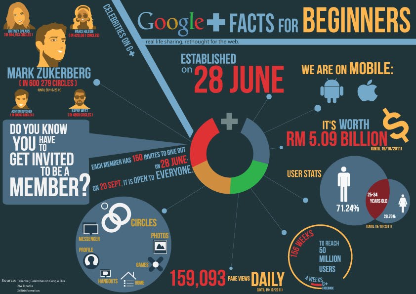
*click image to ENLARGE*
Hi this is my infographic for Google plus. We are limited to 4 colors =)
Im doing a user test so i need you guys to spend a few minutes to answer the question below..All your helps are highly appreciated =)) Thanksss
Leave ur comment here with the following question =))
1. Do you understand this infographic?is it clear?
Yes?
No?..WHY?
2. Do you like the color of the overall?
Yes?
No?..WHY?
3. Do you like the layout and composition of the info?
Yes? No? WHY?
4. What you think about the typography? colors? arragenment? contrast?
Nice/not bad/ ugly
5.Does everything attract you?
Yes
No,you should add something. What is it?
6. Any other comments to help me improve?
1.yes
ReplyDelete2.no,a bit boring...
3.yes
4.all are nice,and colors not bad...
5.yes
6.some info font too small...i not really cant see it...
1.some part not clear. especially the left part ( mark zukerberg...)
ReplyDelete2.is suit for google color scheme , but i prefer more high tech ? overall is okay
3.yes
4.not bad
5.for me..is feel like the color is unbalance in the composition..the center pic..more contract than other part
6. nop
1. yupp
ReplyDelete2. can improve but its still alright
3. interesting layout
4. its ok
5. yes
6. maybe can reduce extra icons :)
1] yes
ReplyDelete2] gud enough for the theme i guess.
3] yes
4] not bad
5] yes
6] could be more detail on the center chart.
1. No. I misunderstood the "+" as an "&" instead of "plus" in the first look..so I read it as "Google & Facts for BEGINNERS", which confused me.
ReplyDelete2. No. overall too dull.
3. Yes, very interesting.
4. -The "?" at the left text box is out of place.
-The "Each member has 150 invites.." can be taken out. It's too messy.
-The "Mark Zukerberg" should be replaced by the "Celebrities on G+" to avoid confusion.
-I simply can't understand the circle box on the left bottom is to show what info. Need better keyword instead of "Circles"
-Font size of "28 June" should be smaller than the title size. It'll lead to wrong focus.
-the font of "real life sharing.." should be similar to the rest. Can be in white and should have spacing for the top of the letters.
-Text can be more aligned and not everywhere.
5. No. Can be less compressed and have more spaces.
6. Interesting layout. Can be better :)
1.yes
ReplyDelete2.definitely yes. good color contrast
3.not really..things are just abit too messy. not sure where to look at, 1st.(composition problem)
4.color, contrast, typo are nice. except the compositing problem which is the arranging problem.
5.yes. color selection and contrasity is very good.
6.size of fonts and arrangement thats all. :)
YES!
ReplyDeleteNO. the color is not attractive, especially the background color, should be darker.
YES! Brilliant!
BEST for me.
Everything attract me! :D at least i read it all!
color, too pale, google chrome color is lighter but it seems too pale here!
nice infographic! LOVE!
GOOD JOB & GOOD LUCK! :)
Answers to Survey - (from Shaii Ong)
ReplyDelete1. Yes, I understand. It is pretty clear.
2. The colours that you used are quite nice, but maybe the hierarchy can be further improved. For instance, you used the blue-grey colour as an overall colour to hold the whole design, so try keep it for lines and dividers and that but not to use it for main content such as logos for the mobiles? Just a suggestion.
3. Layout and composition is good, but could be made better if there was a stronger hierarchy.
4. Made a good effort with the typography, I like most of it except the white part "do you know you have to get invited to be a member?". Maybe try apply the same treatment as the rest of the typo? It doesn't stand out and too white.
5. The visuals are attractive, I think it was a very good effort, but I don't know where to look first, there is no hierarchy/focus.
6. Overall it is a great effort. visually, it is very attractive, just need to take care of the hierarchy. Maybe make the main title/headline stand out from the rest of the content.
All the best with your project, you have really good progress so far.
Hello there! :)
ReplyDelete1. Yes, it's clear.
2. The choice of colours are appropriate, but maybe you can try out another version of putting brighter tone of the four colours u used? It might be more attractive I feel. Or just make 1 main colour brighter. Try it and see. :)
3. The layout overall is okay, just that I feel it's better if you try to rearrange your type for "Do you know" and "Each member" part? try not to put the long text of "each member" slanted because it's a bit hard to read. The font-size is fine but maybe not slanted. "Celebrities" part is fine because it's very short. :)
4. The type treatment for "Do you know" can be better. If you noticed the "?" is touching your speech box already, so try to improve that? As for colour contrast, can try to make one main colour a brighter one, and leave the rest dimmer. This can help to create a nice hierarchy.
5. Overall it's still attractive, you made use of the circles and lines well. :)
6. Nothing else I think, very good effort, keep it up! :D
Mmmm...
ReplyDelete1. Do you understand this infographic?is it clear?
Yes. Information is mostly clear and easy to understand. I think the bottom left part (that says Circles, Photos, Games, Home, etc) could be more clear — right now I know that those are the features/things you can do on Google+, but that's because I already used G+ before, so I know. But other people might not really know what it is? Just a thought.
Also, I got confused on the bottom right circle, the one that is comparing G+ with Facebook on the time it took for them to reach 50 million users. Maybe because the type is too small, that's why I couldn't tell what it was in the beginning. Maybe there are other ways to show that information?
2. Do you like the color of the overall?
I'm okay with it. I'm wondering if you could experiment with more saturated colours? Also, apart from the Google logo and the G+ logo in the centre, I noticed you didn't make use of green colour in the other areas of your infographics? Especially since you're restricted to just 4 colours, lol. But I don't know how it'll look with green la, so if you think it doesn't look nice, don't need to try and make use of it.
3. Do you like the layout and composition of the info?
I think there needs to be a better way to arrange them, in terms of building hierarchy and focus. Right now I feel a lot of things are sized quite similarly.
Also, I don't know if this is the original resolution of your infographics. If it is, then the people on the top left need to be bigger, especially Britney Spears, Paris Hilton and the other two small guys — right now, I can barely read their name, and I can't see how many circles they are in.
I'm not sure if you're restricted to a certain resolution/size, but maybe you could space out some of the sections more loosely, so they won't feel too close to each other. Sometimes it's nice to pack things together, but sometimes it's also nice to have breathing space in the design. Just something to think about?
4. What you think about the typography? colors? arragenment? contrast?
I think the typography has good effort, but can still be better. For example, the way you arranged the "Do you know you have to get invited to be a member?" looks messy to me. Also note the question mark is going out of the speech bubble. Then there are some other little things, like the line spacing of "To reach 50 million users" is uneven, so it doesn't look nice. There are also some alignment issues, like the words "on" and "28 June", they are not properly aligned at the top.
I also think there should be a more systematic way to arrange the type together with the icons in the bottom left circle (the one with the features of G+). Right now, it looks messy and unorganized because the type & logo arrangement are not standardized — some of the type is below the icon, some of it is beside, some of it is on top, etc. Looks messy.
Well... Things like that la.
5.Does everything attract you?
Boleh tahan ba, haha. I think will be much better once you improve it.
6. Any other comments to help me improve?
Nope, all mentioned above. All the best, and keep going at it!
1. kinda.
ReplyDelete2. yes
3. yes
4. not bad
5. not really.
6. arrange was fine. but kinda empty. i don't understand about the 'user stats.