User test time again. Sorry guys and thanks for da help.
So this is an iphone app a series of interface that i designed.
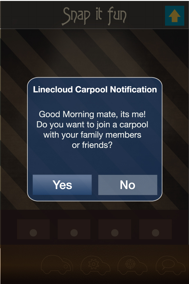
U might see some repetition but actually they are not. It shows the overall flow how it works when u tap or swap the button.
disclaimer: photos used in the design are solely for educational purposes.
PLEASE START FROM BOTTOM..I dunno why the photos that i upload first is at the bottom and the last photo is at the top.
1. Do you get the big idea that im trying to achieve via this iphone app?
2. Do all the interactions show is clear?
3. Do you like the color combination of every page?
2. Do all the interactions show is clear?
3. Do you like the color combination of every page?
4. Do you like the typography shown in page?
5. Any parts that you find that it can be shown clearer or improved?


1.err..carpool right?
ReplyDelete2.ya,it's clear to me
3.page 11,12 and last 4 pages not appealing
4.nop , except those regular font , another not so good
5.first , those typography , i think u need to think what culture of style u want show ..when i see'carpool' i accidentally saw as 'earpool'
second , the messenger part , the red and blue color diagonal line , it's look like a malaysia general mail , and it's a bit weird with ur style.
hope can help u
1.no, i don't get if this is a game app or a messenger app
ReplyDelete2.no
3.yes
4.yes
5.i don't get the carpool part