Thursday, October 18, 2012

Branding Questionnaires


1) What browser do you use?
A) Google Chrome
B)Firefox
C)Safari
D)IE
E)Others

2) How much time do you spend on the internet everyday?
A) < 1 hour
B) 2-5 hours
C) 7-9 hours
D) >9 hours

3)which one of the way do u prefer to buy the product ?
A) online 
B) shop

4)What do you consider when surfing the website?
A) E mail
B) SNS (social network site)
C) the information
D) E commerce activities
E) Video
F) Others Kindly indicate__________________________

5) Will you click on the Advertisement banner in website ?
A) YES
B) NO
Kindly state the reasons____________________

6) What devices you usually using to surf on net?
A) Mobile
B) PC
C) Ipad
D) Other _________________

7) Would you prefer online banner ad or just a static picture with minimum but short sentences ?
10) What is your preferred screen resolution?
A) 1360 x 768 (normal)
B) 1280 x 768 (things get sightly bigger)
C) 1280 x 720 

8) How long would you stay on a website?

9) Do you prefer registration online via facebook account or via email and password?
   
10) What kind of internet stream would you use to access internet?
A) unifi
B) broadband
C) streamyx
D) other

11) What kind of color scheme of websites that attract u more? *no matter what brand/ company it is*?
A) Pastel 
B) Dark
C) Striking
D) Monochromatic
E) Others __________________

12)  what kind of art style u wish to apply on webstie?
A) Modern
B) Vintage
C) Graffiti
D) Collage

13) What kind of navigation bar do you prefer?
A) Horizontal
B) Vertical
C) Drop down menu
D) Text with description
E) Icons & Graphics

14) Do you think the typography design should be suitable for the website/brand ?A) A)Yes
B) No

15) What kind of typography will attract you more?
A) San Serif (eg: Arial, Helvetica, Impact )
B) Serif (eg: Times New Roman, Garamond )
C) Calligraphy
D) Graffiti...Others ____________ 

16) Do you think the flash website will attract you more?
A) Yes
B) No
C) others

17) In a website, what do you think is the most important?
A) More graphic to show more info 
B) More informative text accompanied with some graphic as support
C) Equal

Wednesday, October 10, 2012

Design Method 3

Question : Apart from the musics and props, as a person who is new to dance, how can we differentiate between Chinese and Malay classical dance?

Answer:
Usually for Chinese classical dance, the body movement and the form will be more slower, softer and more feminine. For Malay dance, sometimes the dance movement is tend to be more sharp and fast (eg. Mak Yong).

Also finger gesture is one of the factor that makes the difference. Mostly Chinese dance have a lot of use of circular patterns in space with every part of the body. Besides, Chinese dance is more focused on the eye and hand coordination while Malay dance sometimes are more focused on legworks (eg Zapin).


Zapin


Chinese classical dance

Chinese classical dance has a major use of circular motion because it is believed that circular motion is a central element of form and very specific to Chinese classical dance.


Thursday, June 14, 2012

WD 2 User Test


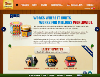
Hi everyone this is another series of my WD2 project.Redesign a commercial website and my client is TigerBalm. So hope you guys can spend a few minutes to give some comment regarding this thanks


1)What do you think about the art style for the website?
A)Very Bad
B)Bad
C)Average
D)Good
E)Very Good

2) What do you think about the layout?
A)Very Bad
B)Bad
C)Average
D)Good
E)Very Good

3)What do you think about the typography design?(in term to suit the theme, readibility, hierachy etc)
A)Very Bad
B)Bad
C)Average
D)Good
E)Very Good

4)What do you think about the content shown? Is it clear enough to explain everything?
A)Very Bad
B)Bad
C)Average
D)Good
E)Very Good

5)Do you think you will get lost in this website?
A)Yes
B)No

6)Anything for me to improved?
PLEASE COMMENT!! Thanks =)


Wednesday, June 6, 2012

Tiger Balm Commercial Website

Hi everyone this is the not yet refined pages for my web design 2 project..Redesign a commercial website and my client is TigerBalm. So hope you guys can spend a few minutes to give some comment regarding this thanks. 2 more pages to go.


Homepage

Products


Products level 2

About

Testimonial

Contact page

1)What do you think about the art style for the website?
A)Very Bad
B)Bad
C)Average
D)Good
E)Very Good

2) What do you think about the layout?
A)Very Bad
B)Bad
C)Average
D)Good
E)Very Good

3)What do you think about the typography design?(in term to suit the theme, readibility, hierachy etc)
A)Very Bad
B)Bad
C)Average
D)Good
E)Very Good

4)What do you think about the content shown? Is it clear enough to explain everything?
A)Very Bad
B)Bad
C)Average
D)Good
E)Very Good

5)Do you think you will get lost in this website?
A)Yes
B)No

6)Anything for me to improved?
PLEASE COMMENT!! Thanks =)


Thursday, May 10, 2012

Tigerbalm's competitors website with analysis

Eagle Brand

http://www.bordeneagle.com.sg/


This is a flash based website with simple and nice loading bar. 

At the first glace, we roughly can know what is the product they selling. 

Besides, i like the way they show their products. It is more interesting and interactive where user can navigate themselves to view the product. However, the buttons design to navigate can be better.

They used those nature landscape as the background to give viewers a very soothing and comfortable feeling.

But I don't like the overall color of the website. It makes the whole site looks dull and not able to give viewers a completely confortable feeling.

Amrutanjan

http://www.amrutanjan.com/


Another website with green as the main color to create a pure,healthy and nature feeling to suit the concept of the brand itself. Overall the website is very static and more looks like a template design.

They also don't have their own typography design. Mainly just normal texts against white background.

The way they display their products also not really user friendly enough. Viewers always have to select the products from the navigation. Other than that, the arrangement of typography very messy and not interesting.

Vicks

http://www.vicks.com/


Vicks website also use green and blue as their website color as this is their coporate color. The biggest problem i found in this website is the interactivity for the users. It is not friendly at all in term of users.

I feel that there're too much things for me to click and i don't know where to start. When i go to PRODUCTS, there's another thing for me to click. When i click on the particular product to read more details, there's another sub category for me to click. I feel there's too much nested structure in the website and the whole structure of the website is very complicated.

Axe Brand

http://www.axebrand.com.sg/


A website with very simple design. Everything was in a very old school style especially the navigation and the website also doesn't speak for the brand. 

The products page also look like a web blog format instead of a website.

Web Design 2 - Beautiful Websites with analysis

Ready Hang

http://www.readyhang.com/home


A normal website but the arrangement of data and information is in horizontal thus make the whole website looks long horizontal visually.

The target audience is more to adults that own a home. Thus there's the simple layout and soothing,comfortable colors to make it look very homey.

But one thing I don't like is the messy typography in the homepage.

Sony

http://www.sony.com/index.php


Very clean and neat website with almost black and white color(navigation+texts)  to suit the branding color of Sony.

Like the "featured" section at the homepage where they display the huge PSP  with some information beside. This way definitely able to catch viewers attention to read and see.

Clear navigation with drop down menu. More user friendly for viewers to locate the page they wanted to reach.

Bonia

http://www.bonia.com.my/


Another elegant and classy design to suit the status of the brand itself. Very consistent image art style that have been used.

Love the way they organise their information for their products by gender.

Also the products section are clear and user friendly. But one thing to improve is that different views for the products can be added such as side view, top view etc. It might be more helpful for the buyers to view it on website.

Besides, they also divided their navigations to two different sections which is one is related to the brand like the products, their stores, events etc while the other one is more towards the users like job opportunities, contact page, register for newsletter etc. I feel that it is more clear to categorise them in this way and won't make overall looks complicated.

KFC 

http://www.kfc.com/default.asp


A very redish website that represent the branding color of KFC. Other than red, beidge and blue color can be used as well. 

But i feel the reason why red is use is to trigger the appetite of the viewers as red believed is the color that can make people's appetite better..Afterall, this is a food website.

Besides, the arrangement of visuals and typography is very interesting. Fonts design also very consistent in every pages.

First thing i feel that can be improved is the clickable button colors. Now the contrast of the button color against the background color is very low. Thus it don't really make me feel like clicking it. Beige color button on the red background will be more outstanding though =)

Secondly, instead of the sub category only appear at the sidebar when we reached the main category. Drop down menu should be included so that viewers know which page they wanted to go is belong to which category. 


Thursday, April 12, 2012

Minion's Escape

Mini flash game fully done by actionscript3.0..This is a 99% done. The minor refined one forget to transfer back.


Thanks karen and joanne so much..Learnt extremely much from this class..Can u spot them btw? lol..=)