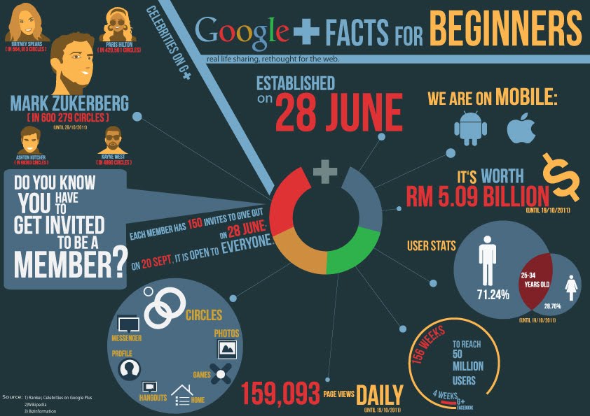
*click image to ENLARGE*
Hi this is my infographic for Google plus. We are limited to 4 colors =)
Im doing a user test so i need you guys to spend a few minutes to answer the question below..All your helps are highly appreciated =)) Thanksss
Leave ur comment here with the following question =))
1. Do you understand this infographic?is it clear?
Yes?
No?..WHY?
2. Do you like the color of the overall?
Yes?
No?..WHY?
3. Do you like the layout and composition of the info?
Yes? No? WHY?
4. What you think about the typography? colors? arragenment? contrast?
Nice/not bad/ ugly
5.Does everything attract you?
Yes
No,you should add something. What is it?
6. Any other comments to help me improve?