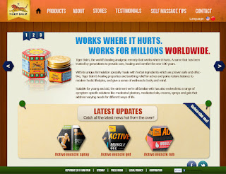


Hi everyone this is another series of my WD2 project.Redesign a commercial website and my client is TigerBalm. So hope you guys can spend a few minutes to give some comment regarding this thanks
1)What do you think about the art style for the website?
A)Very Bad
B)Bad
C)Average
D)Good
E)Very Good
2) What do you think about the layout?
A)Very Bad
B)Bad
C)Average
D)Good
E)Very Good
3)What do you think about the typography design?(in term to suit the theme, readibility, hierachy etc)
A)Very Bad
B)Bad
C)Average
D)Good
E)Very Good
4)What do you think about the content shown? Is it clear enough to explain everything?
A)Very Bad
B)Bad
C)Average
D)Good
E)Very Good
5)Do you think you will get lost in this website?
A)Yes
B)No
6)Anything for me to improved?
PLEASE COMMENT!! Thanks =)
A)Very Bad
B)Bad
C)Average
D)Good
E)Very Good
2) What do you think about the layout?
A)Very Bad
B)Bad
C)Average
D)Good
E)Very Good
3)What do you think about the typography design?(in term to suit the theme, readibility, hierachy etc)
A)Very Bad
B)Bad
C)Average
D)Good
E)Very Good
4)What do you think about the content shown? Is it clear enough to explain everything?
A)Very Bad
B)Bad
C)Average
D)Good
E)Very Good
5)Do you think you will get lost in this website?
A)Yes
B)No
6)Anything for me to improved?
PLEASE COMMENT!! Thanks =)


1)What do you think about the art style for the website?
ReplyDeleteD
2) What do you think about the layout?
D
3)What do you think about the typography design?(in term to suit the theme, readibility, hierachy etc)
C
4)What do you think about the content shown? Is it clear enough to explain everything?
C
5)Do you think you will get lost in this website?
B
6)Anything for me to improved?
Color scheme can be more attractvive and background is quite plain
1)What do you think about the art style for the website?
ReplyDeleteD)Good
2) What do you think about the layout?
D)Good
3)What do you think about the typography design?(in term to suit the theme, readibility, hierachy etc)
C)Average
4)What do you think about the content shown? Is it clear enough to explain everything?
C)Average
5)Do you think you will get lost in this website?
B)No
6)Anything for me to improved?
the website maybe like too short adi...make it longer then will hv much more spacing wont be too congest now..
the product page type treatment will be apply too much adi..
and the self massage page, the middle mayb all are same important so din hav a focus point.
C - I can't really see the identity of the product itself. The product is came from a SG chinese background, although it's in english but we can still see the identity from the logo and the packaging(bottle one). From the latest news we can see the company releasing new product and the design is totally changed from the old design, from this point you can see that they trying to gain attention from angmo, so they start implement angmo figure into the website. I just feel that your current design doesn't fit into either the old one (traditional) or the new one (modern). Color wise can be better, yellow, green, orange, red, blue is all in each pages, it's quite distracting.
ReplyDeleteB - About, Store and Contact is fine, others is even messier than the original website. Every contents seem pack together and I can't get the hierarchy. Did you thought of make few pages in long page? I mean with scroll bar.
C - Font for title (name, e-mail, website, etc.) and the content is too pack, lose a lil bit will be better. Don't use Italic, it's really hard to read in content. Main problem is the font colors. Too much colors apply on title already. Other is fine.
D - Yea it's clear. Just too pack.
B - Breadcrumbs lead it well.
Think again on the layout design and the art direction. People can notice the inconsistent from the Facebook and Twitter logo, it doesn't fit the art direction of the whole page. Other is what I listed above. Don't know what I said will hurt your feeling or not (I know that feeling) but I really hope you to improve. Gambateh and Good Luck bro! :)
1 D
ReplyDelete2 C
3 C
4 c
5 B
6 Overall it has a very clean and moderate art direction. The typography for the text are alright although some seems to be to bold for the title. The tracking for the contents are to near to each other and thus making it hard for people to read, it is not practical. There are still room for improvement but overall this is good
1)D
ReplyDelete2)C
3)C
4)C
5)B
6)I does not like the color mood of this website due to it's too much colored and the color does not link together. It's like too much color spill around, a little bit messy.Besides, i also dont find the wood background pretty, because for me, the color is between old style and modern style of this product. Overall, still have much room to improve. By the way thanks for this invitation. Gambateh!
1) C
ReplyDeleteStill looks pretty simple. I think it's the choice of text or the way the logo is placed
2) D
Looks alright but always space for improvement.
3) C
4) D
5) B
6) looks alright. could use more work but this is nice enough