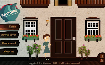
This is the few pages of the website..It teaches how to save money in ur daily lifestyle from a housewife point of view.
For the tips section, at the bottom part is actually an interactive media for you play around with=))
Hope you guys can spend a few mins to give some comment and review on it =)) Thanks!


1)What do you think about the art style for the website?(combination of montage and vector)
A)Very Bad
B)Bad
C)Average
D)Good
E)Very Good
2) What do you think about the layout?
A)Very Bad
B)Bad
C)Average
D)Good
E)Very Good
3)What do you think about the typography design?(in term to suit the theme, readibility, hierachy etc)
A)Very Bad
B)Bad
C)Average
D)Good
E)Very Good
4)What do you think about the content shown? Is it clear enough to explain everything?
A)Very Bad
B)Bad
C)Average
D)Good
E)Very Good
5)Do you think you will get lost in this website?
A)Yes
B)No
6)Anything for me to improved?
PLEASE COMMENT!! Thanks =)
7)If you friends wanted to save money,will you introduced them this website?
A)Yes
B)No


1 , D
ReplyDelete2 , E
3 , C
4 , C
5 , Kinda
6 , Er no LOL maybe the character?
7 , A
pteng
This comment has been removed by the author.
ReplyDelete1. C
ReplyDelete2. C
3. B
4. E
5. B
6. Kind of mess about the image( I mean the fridge...and all those things)
7. A for sure :)
C
ReplyDeleteC
D
D
B
somehow in my opinion i feel like the sixth picture with the groceries is a bit unfit for the whole picture ..
Yup
1)What do you think about the art style for the website?(combination of montage and vector)
ReplyDeleteC)Average
2) What do you think about the layout?
C)Average
3)What do you think about the typography design?(in term to suit the theme, readibility, hierachy etc)
C)Average
4)What do you think about the content shown? Is it clear enough to explain everything?
D)Good
5)Do you think you will get lost in this website?
B)No
6)Anything for me to improved?
I'll comment based on the questions.
i) In my opinion, montage + vector combination is not easy to do nicely, so it's good to see you try. But I think there still needs to be more exploration to determine how to make the vector suitable with the montage.
Example: how do you balance them and make them look good with each other? Should the vector graphics be more polished/realistic/detailed so it goes well with montage? Should the vector graphics have more vibrant colours to stand out, or should they use more matured colours to pair up with the montage? It's something to analyse and find out. Check out good website examples, then study how they do it.
One thing to take care of is consistency. At the Homepage, there is a lot more vector compared to montage. But once you enter, most of the elements are all montaged. This makes the art style feel inconsistent.
ii) Layout. I am not sure if you are required to do a fixed, small layout such as this. As you are trying to present more information, I feel the website would benefit more from a longer/taller layout, so that you have more space to layout the content in a nicer way.
Right now, it feels like you are restricting yourself to a very small piece of space, which forces you to cramp things in. There's no room to breathe in the layout.
Also, what is the purpose of the Home page? Instead of putting in only graphics, you should put some content in it as well. Like, "view tip of the day!" or "come and meet Marie!" which will link to their respective sections. Invite the user to explore the content. Don't leave them hanging.
iii) Some of the fonts used for explanations is too small. Example, "hit the button to on/off the lights according to situation", "Drag the 3 materials to the wok" and so on. They are too small for reading. This kind of font size should be used for your footer instead. (Yes, your copyright fonts should be smaller)
iv) Content is okay.
v) Since the section title is always shown, I probably won't get lost.
At the tips section, the tips shown are based on which object you click on, right? (e.g. if click on the shower, then it will show tips on cutting back utilities). If this is the case, you should add in a Close button for the tip being shown, otherwise it doesn't seem like I can close the current tip and see others.
Hope I'm not too harsh with my comments, haha. Keep working on it, keep on improving! (:
7)If you friends wanted to save money,will you introduced them this website?
B)No
(Lol)