Web Design class with Din and Felicia =)
So here are the few screenshots of photoshop and illustrator tutorial websites. Also there's a website with tutorial on designing which i think its pretty nice..

AiVault
This design tutorial website..Clean and organised..
PSD Learning
Good-Tutorials
Photoshop Tutorials

Tuts+
So here are the other websites that i think its really beautiful.
ABDUZEEDO
http://abduzeedo.com/
- A website that consist a lot of things related to design from tutorials, inspiration and so on. I like this website because of the background colors,buttons that make everything very classy. Besides, the overall layout is very clean and neat. All the images displayed size also very consistent which also helps to make the website looks neat.
APBAXTER

http://www.apbaxter.com/
-The reason i like this website bcoz of the colors that attractive me at first. With four colums layout with 4 images at the front page makes it slighty different from other websites. Then,the icons at the footer are also very interesting. Less texts makes it special.
APPLE
http://apple.com
-Apple INC website is always my favourite even though a lot of you might think its just a normal website. I like this website a lot bcoz of the cleanliness in it..It looks similiar with the abduzeedo website bcoz of the images size displayed. There's always a bigger size for the featured news to attract people's attention with the smller size images at the bottom featuring the sub news. Also the typography treatment makes it very professional.
DRIBBBLE
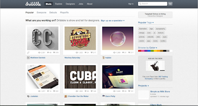
http://dribbble.com/
-Dribble website is a very useful website that provide some good works to inspire the designers out there. Other than that it is very informative and clear because there's a tag column at the right sidebar. I think that a design website most important is there must always have a tag to categorised different category of design like web, interactive, logo, icons etc. Other than that, all the images shown is very straightforward and clear and you wont see a lot of ads that cause distraction.
Cast Iron Design
http://www.castirondesign.com/
- This website is beautiful and attractive because of the art style applied. Classy and looks vintage at the same time which suit my taste a lot. Also the information at the website are very organised and clear. Also i like how they designer the footer with the very nice typography. Besides, all the fine lines and thin dotten lines used as the seperator are simple yet appealing.
Lake Nona
http://learnlakenona.com/
- Another quite interesting website for me. At the top part it looks simple with not many info but the visuals attracts me. A simple header with some simple shapes around. When it goes to the middle part, i like the way they layout the news. Space saving but doesnt cause confusion to people. At the right part, there's also a little interactive part for us to click. But I don't really like the footer part. It doesnt look consistent with the top part and also the readability of the texts is slightly lower because of the color contrast between texts and background.
3 initial ideas
How to connect and disconnect gas propane cylinder
Art direction: Freestyle handrawing with pastel color scheme
How to prevent pickpocketing?
Keep nothing valuable inside our pocket,avoid walking through large crowds, close the bag and pocket zippers etc.
How it happen?
Art directon: Minimal flat colors
How to save money?
When you must go out combine errands, Pay with cash, recycle, make grocery list
Vintage, pastel color scheme
Who i am: Housewives