Thursday, May 10, 2012

Tigerbalm's competitors website with analysis

Eagle Brand

http://www.bordeneagle.com.sg/


This is a flash based website with simple and nice loading bar. 

At the first glace, we roughly can know what is the product they selling. 

Besides, i like the way they show their products. It is more interesting and interactive where user can navigate themselves to view the product. However, the buttons design to navigate can be better.

They used those nature landscape as the background to give viewers a very soothing and comfortable feeling.

But I don't like the overall color of the website. It makes the whole site looks dull and not able to give viewers a completely confortable feeling.

Amrutanjan

http://www.amrutanjan.com/


Another website with green as the main color to create a pure,healthy and nature feeling to suit the concept of the brand itself. Overall the website is very static and more looks like a template design.

They also don't have their own typography design. Mainly just normal texts against white background.

The way they display their products also not really user friendly enough. Viewers always have to select the products from the navigation. Other than that, the arrangement of typography very messy and not interesting.

Vicks

http://www.vicks.com/


Vicks website also use green and blue as their website color as this is their coporate color. The biggest problem i found in this website is the interactivity for the users. It is not friendly at all in term of users.

I feel that there're too much things for me to click and i don't know where to start. When i go to PRODUCTS, there's another thing for me to click. When i click on the particular product to read more details, there's another sub category for me to click. I feel there's too much nested structure in the website and the whole structure of the website is very complicated.

Axe Brand

http://www.axebrand.com.sg/


A website with very simple design. Everything was in a very old school style especially the navigation and the website also doesn't speak for the brand. 

The products page also look like a web blog format instead of a website.

Web Design 2 - Beautiful Websites with analysis

Ready Hang

http://www.readyhang.com/home


A normal website but the arrangement of data and information is in horizontal thus make the whole website looks long horizontal visually.

The target audience is more to adults that own a home. Thus there's the simple layout and soothing,comfortable colors to make it look very homey.

But one thing I don't like is the messy typography in the homepage.

Sony

http://www.sony.com/index.php


Very clean and neat website with almost black and white color(navigation+texts)  to suit the branding color of Sony.

Like the "featured" section at the homepage where they display the huge PSP  with some information beside. This way definitely able to catch viewers attention to read and see.

Clear navigation with drop down menu. More user friendly for viewers to locate the page they wanted to reach.

Bonia

http://www.bonia.com.my/


Another elegant and classy design to suit the status of the brand itself. Very consistent image art style that have been used.

Love the way they organise their information for their products by gender.

Also the products section are clear and user friendly. But one thing to improve is that different views for the products can be added such as side view, top view etc. It might be more helpful for the buyers to view it on website.

Besides, they also divided their navigations to two different sections which is one is related to the brand like the products, their stores, events etc while the other one is more towards the users like job opportunities, contact page, register for newsletter etc. I feel that it is more clear to categorise them in this way and won't make overall looks complicated.

KFC 

http://www.kfc.com/default.asp


A very redish website that represent the branding color of KFC. Other than red, beidge and blue color can be used as well. 

But i feel the reason why red is use is to trigger the appetite of the viewers as red believed is the color that can make people's appetite better..Afterall, this is a food website.

Besides, the arrangement of visuals and typography is very interesting. Fonts design also very consistent in every pages.

First thing i feel that can be improved is the clickable button colors. Now the contrast of the button color against the background color is very low. Thus it don't really make me feel like clicking it. Beige color button on the red background will be more outstanding though =)

Secondly, instead of the sub category only appear at the sidebar when we reached the main category. Drop down menu should be included so that viewers know which page they wanted to go is belong to which category. 


Thursday, April 12, 2012

Minion's Escape

Mini flash game fully done by actionscript3.0..This is a 99% done. The minor refined one forget to transfer back.


Thanks karen and joanne so much..Learnt extremely much from this class..Can u spot them btw? lol..=)

Thursday, March 29, 2012

New Media

Don't worry,it loads..
The moving dots will gone soon!
But please wait =)))) Thanks..


Its a projected screen in the toilet that looks like this.

Sunday, March 11, 2012

Web Design 1

This is the few pages of the website..It teaches how to save money in ur daily lifestyle from a housewife point of view.

For the tips section, at the bottom part is actually an interactive media for you play around with=))

Hope you guys can spend a few mins to give some comment and review on it =)) Thanks!


1)What do you think about the art style for the website?(combination of montage and vector)
A)Very Bad
B)Bad
C)Average
D)Good
E)Very Good

2) What do you think about the layout?
A)Very Bad
B)Bad
C)Average
D)Good
E)Very Good

3)What do you think about the typography design?(in term to suit the theme, readibility, hierachy etc)
A)Very Bad
B)Bad
C)Average
D)Good
E)Very Good

4)What do you think about the content shown? Is it clear enough to explain everything?
A)Very Bad
B)Bad
C)Average
D)Good
E)Very Good

5)Do you think you will get lost in this website?
A)Yes
B)No

6)Anything for me to improved?
PLEASE COMMENT!! Thanks =)

7)If you friends wanted to save money,will you introduced them this website?
A)Yes
B)No

Wednesday, February 8, 2012

Fly me to the moon

First assignment for DGM2 subject..Not something fancy though but at least able to finish everything =)) Basically its all done in flash using actionscript.

Tuesday, January 3, 2012

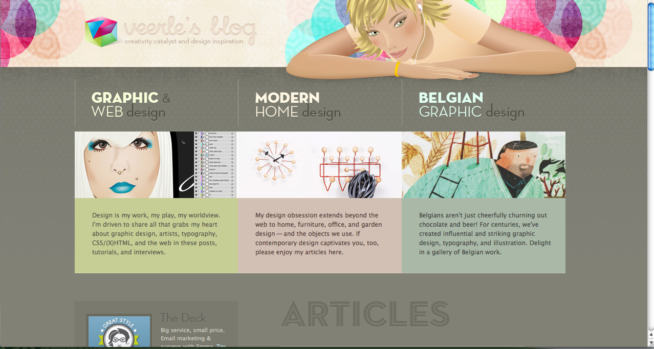
Web Screenshots

Web Design class with Din and Felicia =)

So here are the few screenshots of photoshop and illustrator tutorial websites. Also there's a website with tutorial on designing which i think its pretty nice..

AiVault

This design tutorial website..Clean and organised..

PSD Learning

Good-Tutorials

Photoshop Tutorials

Tuts+

So here are the other websites that i think its really beautiful.

ABDUZEEDO
http://abduzeedo.com/

- A website that consist a lot of things related to design from tutorials, inspiration and so on. I like this website because of the background colors,buttons that make everything very classy. Besides, the overall layout is very clean and neat. All the images displayed size also very consistent which also helps to make the website looks neat.

APBAXTER


http://www.apbaxter.com/

-The reason i like this website bcoz of the colors that attractive me at first. With four colums layout with 4 images at the front page makes it slighty different from other websites. Then,the icons at the footer are also very interesting. Less texts makes it special.

APPLE
http://apple.com

-Apple INC website is always my favourite even though a lot of you might think its just a normal website. I like this website a lot bcoz of the cleanliness in it..It looks similiar with the abduzeedo website bcoz of the images size displayed. There's always a bigger size for the featured news to attract people's attention with the smller size images at the bottom featuring the sub news. Also the typography treatment makes it very professional.

DRIBBBLE

http://dribbble.com/

-Dribble website is a very useful website that provide some good works to inspire the designers out there. Other than that it is very informative and clear because there's a tag column at the right sidebar. I think that a design website most important is there must always have a tag to categorised different category of design like web, interactive, logo, icons etc. Other than that, all the images shown is very straightforward and clear and you wont see a lot of ads that cause distraction.

Cast Iron Design


http://www.castirondesign.com/

- This website is beautiful and attractive because of the art style applied. Classy and looks vintage at the same time which suit my taste a lot. Also the information at the website are very organised and clear. Also i like how they designer the footer with the very nice typography. Besides, all the fine lines and thin dotten lines used as the seperator are simple yet appealing.

Lake Nona


http://learnlakenona.com/

- Another quite interesting website for me. At the top part it looks simple with not many info but the visuals attracts me. A simple header with some simple shapes around. When it goes to the middle part, i like the way they layout the news. Space saving but doesnt cause confusion to people. At the right part, there's also a little interactive part for us to click. But I don't really like the footer part. It doesnt look consistent with the top part and also the readability of the texts is slightly lower because of the color contrast between texts and background.

3 initial ideas

How to connect and disconnect gas propane cylinder
Art direction: Freestyle handrawing with pastel color scheme

How to prevent pickpocketing?
Keep nothing valuable inside our pocket,avoid walking through large crowds, close the bag and pocket zippers etc.
How it happen?
Art directon: Minimal flat colors

How to save money?
When you must go out combine errands, Pay with cash, recycle, make grocery list
Vintage, pastel color scheme
Who i am: Housewives